Context & Challenge
The client was a leading Luxembourg-based boutique firm in the finance and tax sector, serving high-profile clients across Europe. While their expertise in finance was world-class, their internal intranet system was outdated, and slowing teams down.
What should have been a central productivity hub was instead a source of constant frustration:
Slow and unclear workflows: simple actions like adding a contact or tracking an event could take upwards of 15 minutes.
Duplicated work: many partners resorted to Excel for offers and pitches, even though flows technically existed in the intranet.
Difficulty finding information: client data and interactions were buried in poor navigation and broken flows.
For a company where partners’ time is extremely valuable, this inefficiency had a real cost: lost time, reduced productivity, and missed opportunities to strengthen client relationships.
My Role
I was brought in as the sole designer, owning the entire process from research to delivery. I collaborated closely with a team of 3 full-stack developers (including 2 senior devs), 1 frontend developer, and a project manager.
I led:
Research & discovery: uncovering pain points and mapping real user workflows.
UX design: redesigning flows for speed, clarity, and usability.
UI design: creating a modern, consistent interface that matched the firm’s professionalism.
Delivery: handing off high-fidelity prototypes and design specifications to developers.
Research & discovery
Redesigning the intranet was about understanding the deep-rooted problems that made the system frustrating to use, despite being mission-critical. I approached discovery with a layered research plan, combining UX heuristics, stakeholder alignment, and real user empathy.
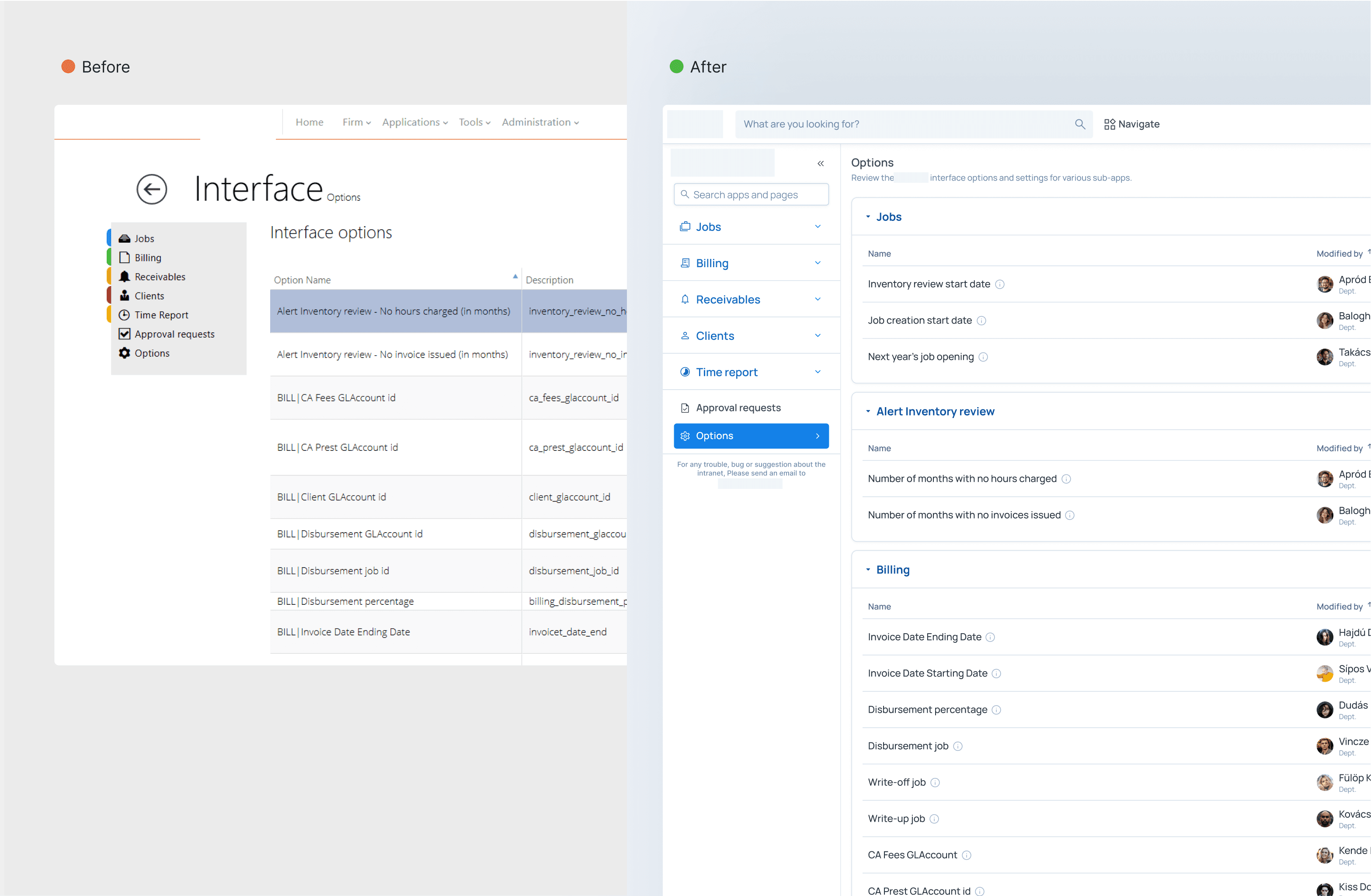
UX Audit: Understanding the Legacy System
I began with a full UX and UI audit of the existing intranet. The system was originally developed in 2010 and hadn’t been significantly updated since. Key findings included:
Wasted space: The layout was narrow and didn’t utilize full screen width, making dense content harder to read.
Inconsistent patterns: Button styles, field groupings, and modal behaviors varied wildly across modules.
Cluttered screens: Information was presented without hierarchy, making it difficult to scan or prioritize.
Redundant workflows: Common actions like assigning jobs or submitting audit notes required too many steps.
These insights became the baseline for performance and usability benchmarks.

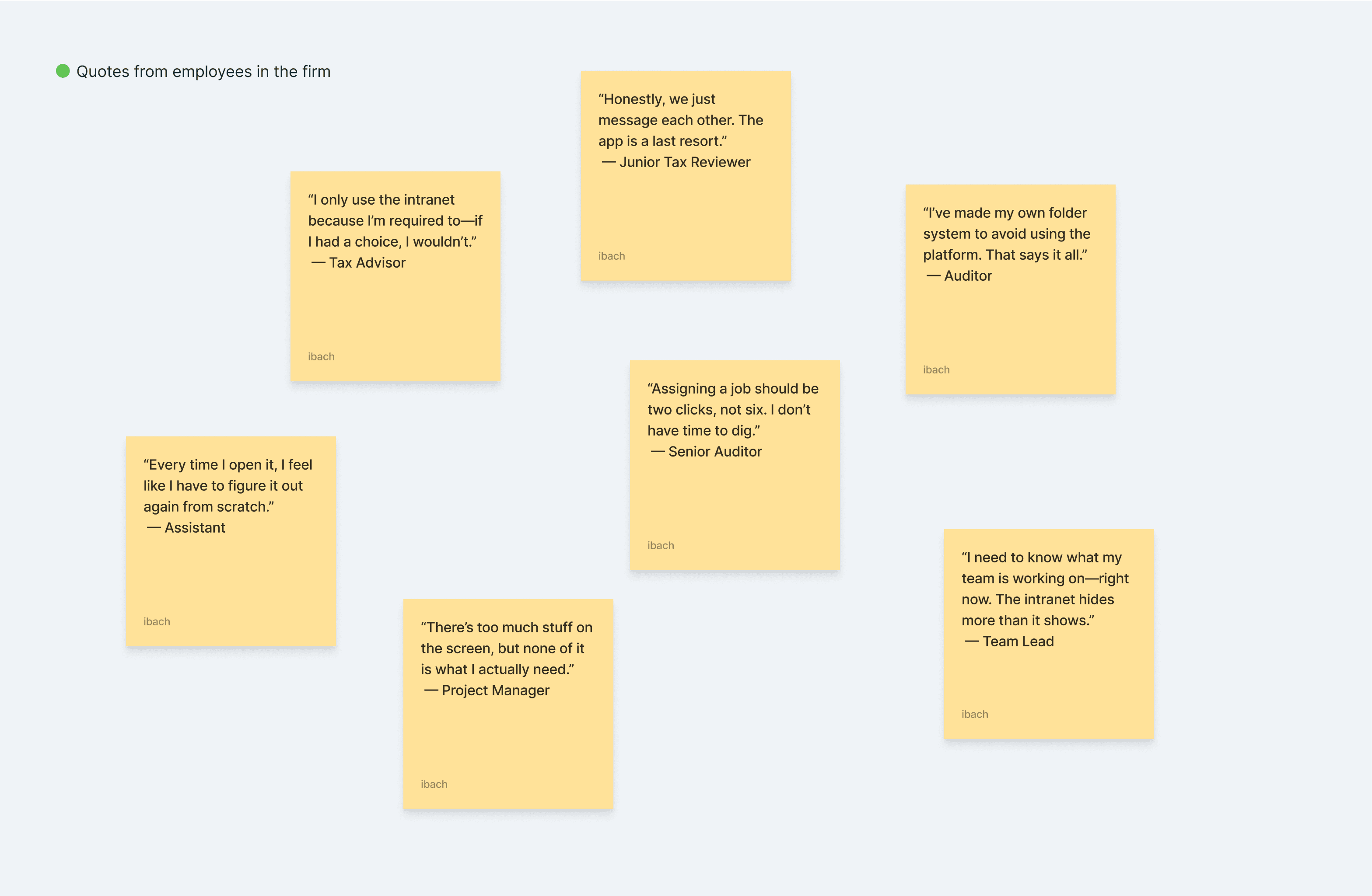
User interviews: hearing the frustration firsthand
To ground my assumptions, I conducted interviews with over a dozen users across departments auditors, managers, tax advisors, and administrative support.
Auditors wanted to quickly track assignment status and update files without jumping across modules.
Team leads needed visibility on job progress, dependencies, and internal communication.
Support staff were overwhelmed by repetitive tasks and hard-to-find data.
Role | Pain Points | Key Needs |
|---|---|---|
Auditor | Too many clicks for task updates | Inline editing, status filters |
Team Lead | Lack of overview, poor task tracking | Dashboard, bulk actions |
Tax Advisor | Cluttered layout, irrelevant data | Personalized views |
I also ran informal contextual inquiries, watching how users actually worked inside the tool versus how they described it.
“I’ve built my own folder system on my desktop just so I don’t have to touch the intranet more than I need to.”
— Tax expert
“Everything takes too long. Assigning a job should be quick, not a headache.”
— Senior auditor
Synthesis: friction everywhere
From research, a few clear pain themes surfaced:
Avoidance behavior
Users were actively building workarounds, Excel trackers, direct messaging, alternative tools, just to bypass core features.Information chaos
There was no clear labeling system. Pages had 10+ modules jammed together without logical grouping or priority.Workflow inefficiencies
Key tasks like creating job assignments, tracking tax reviews, or updating audit statuses required navigating through too many unrelated screens.One-Size-Fits-None, building the same app for many people serves none of them
The intranet lacked any role-based customization. Whether you were an entry-level assistant or a manager, you saw the same bloated dashboard.No trust in the system
Frequent bugs, poor feedback loops, and visual inconsistency made users second-guess every action they took.
Key goals I set
I consolidated all feedback into five actionable redesign pillars:
Restructure the information architecture
Flatten the navigation and make core features accessible in 1–2 clicks.Streamline Priority Flows
Design faster, smarter workflows for job assignment, audit management, and internal search.Role-Based Dashboards
Surface relevant data and actions based on user type, cutting down on information noise.Modern UI with Real Hierarchy
Introduce modular layouts, clear typography, and consistent visual components.Rebuild Confidence
Ensure every interaction feels intentional, fast, and reliable—restoring user trust in the tool.
This phase was about distilling chaos into clarity. It gave me the insight and strategic direction I needed to reimagine the intranet not as a tool users tolerated, but one they trusted and relied on.

Design Process
Mapping workflows: I redefined user journeys for common tasks like creating contacts, logging events, and tracking pitches.
Information architecture: simplified navigation ensured data was always easy to find.
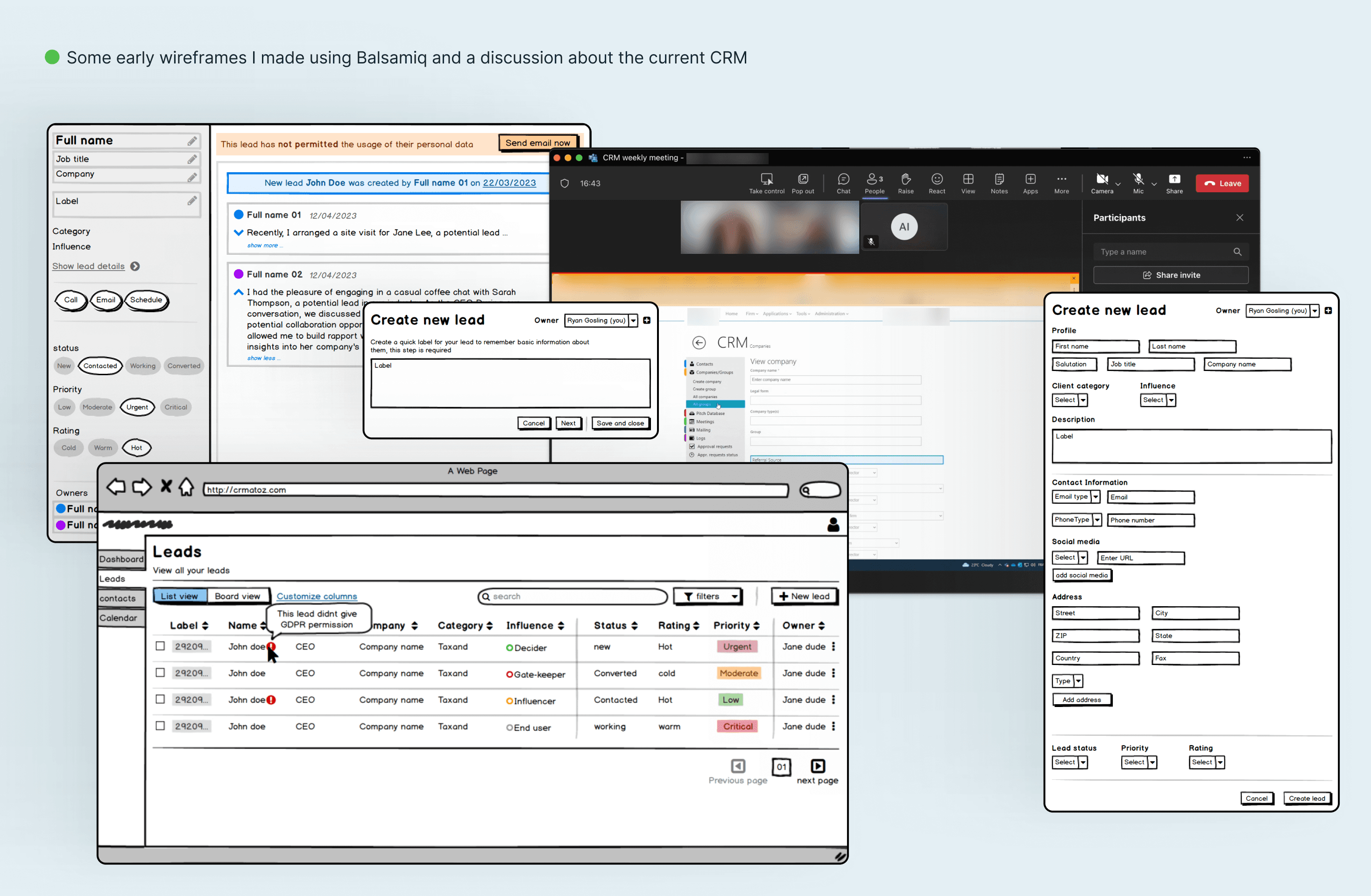
Wireframing & iteration: tested early flows to validate speed and clarity.
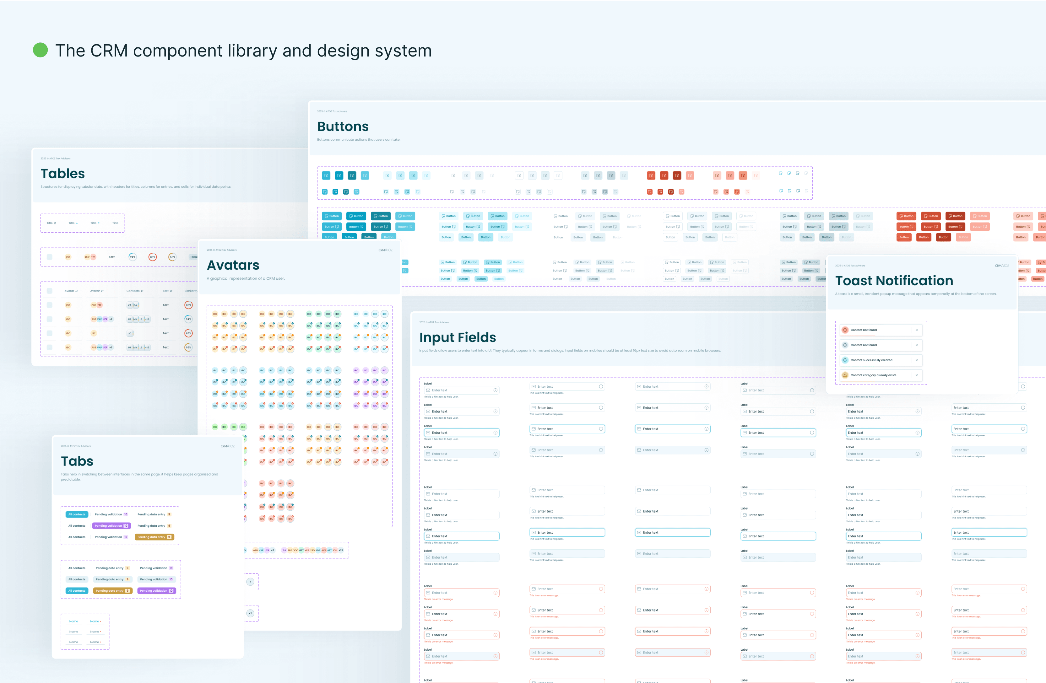
UI design: built a clean, modern interface reflecting the firm’s professionalism while keeping usability front and center.
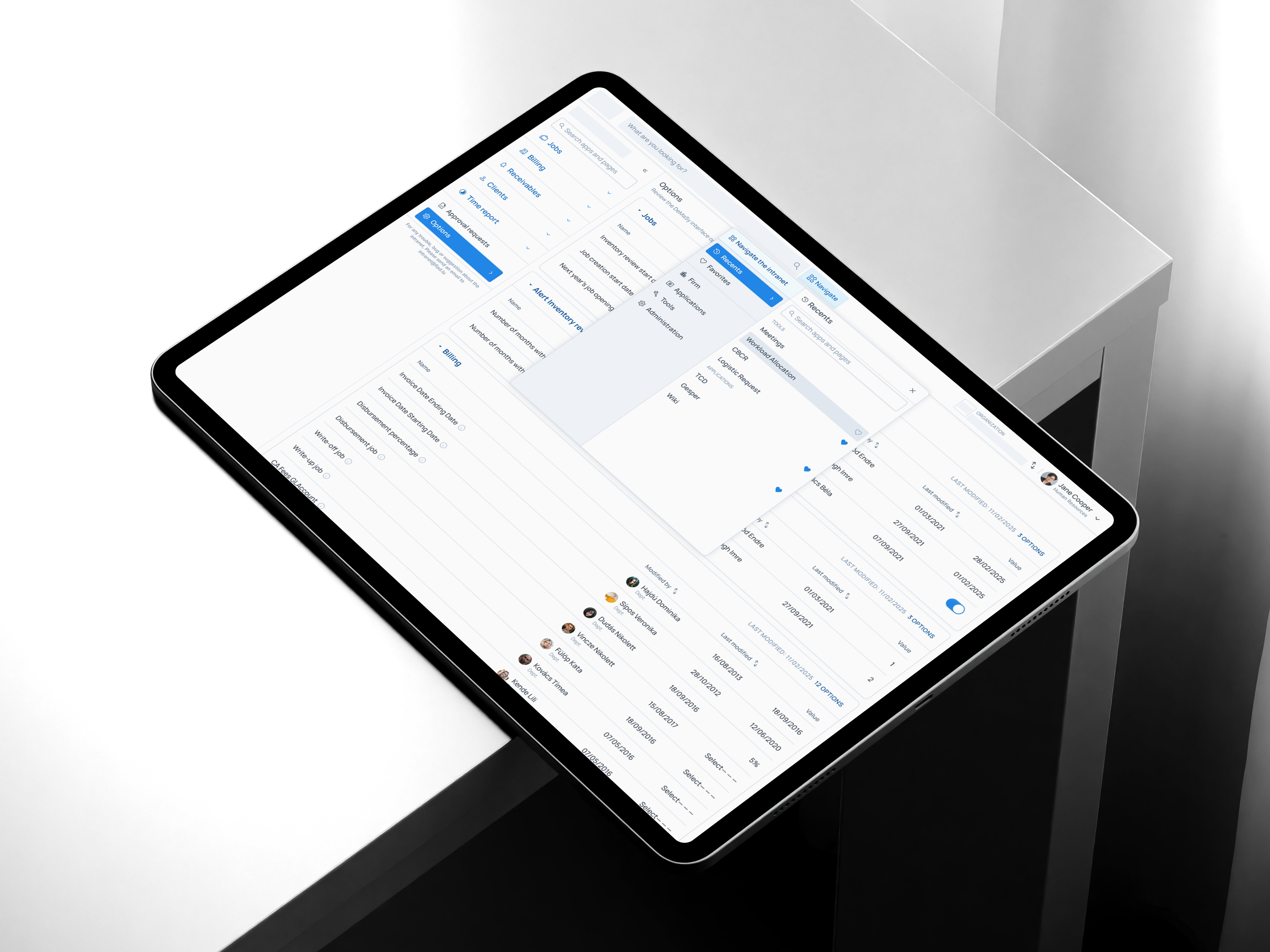
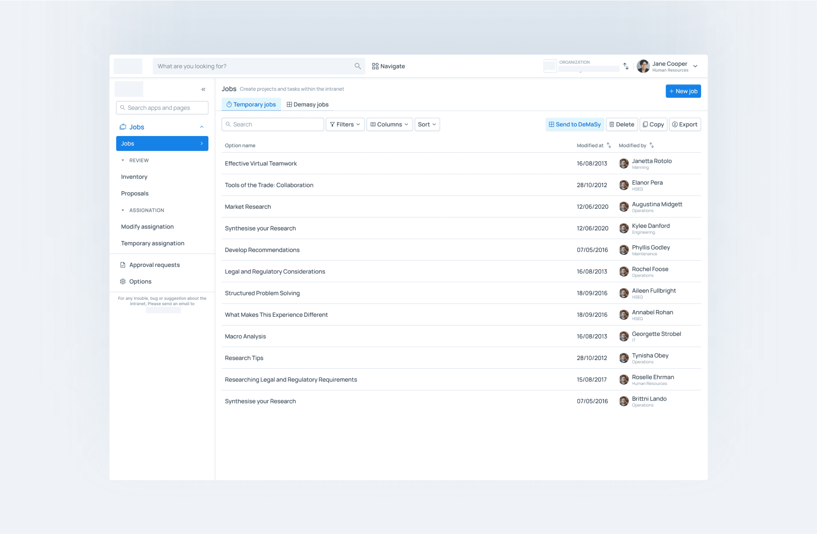
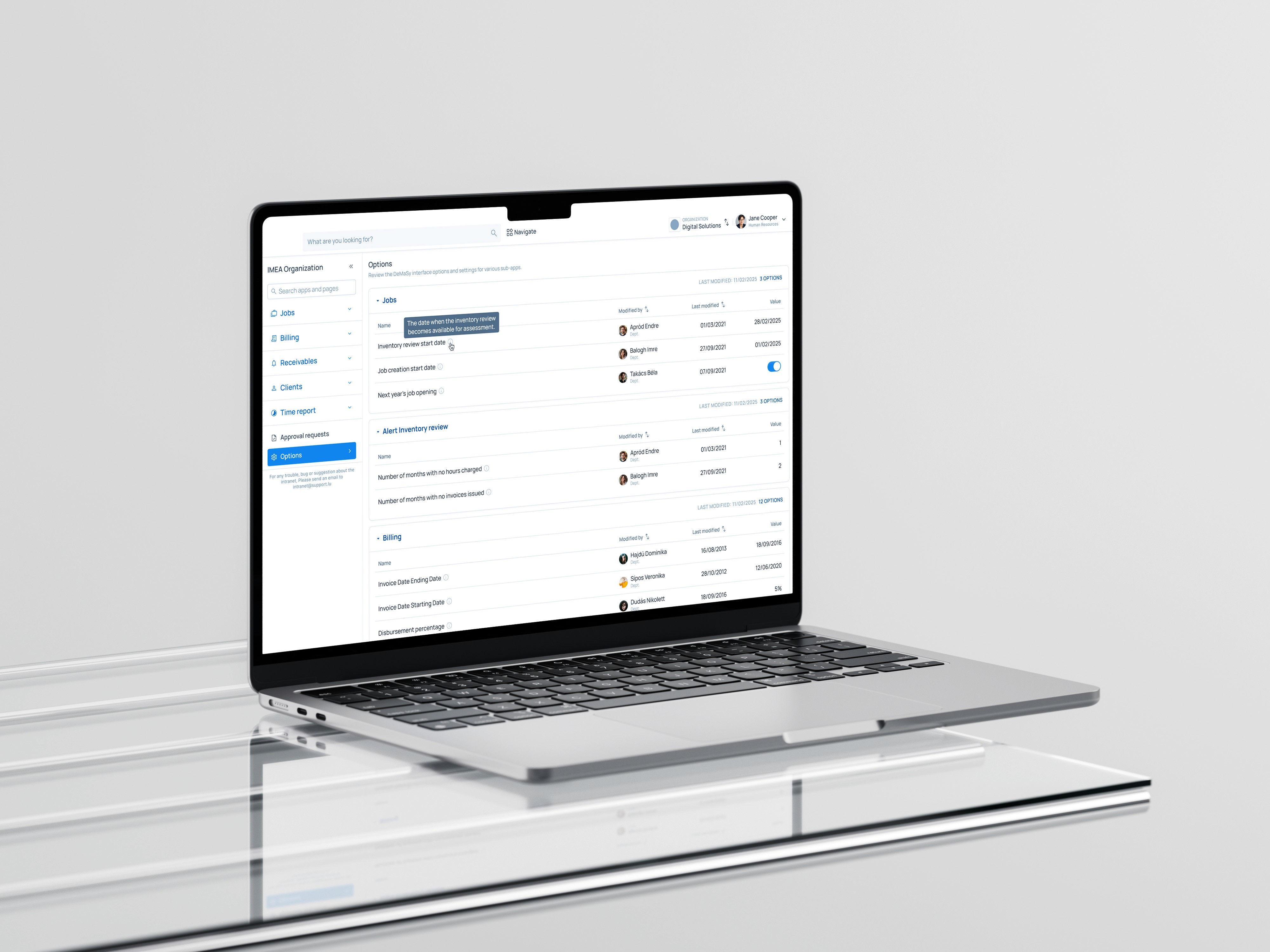
The Solution
The redesigned intranet delivered:
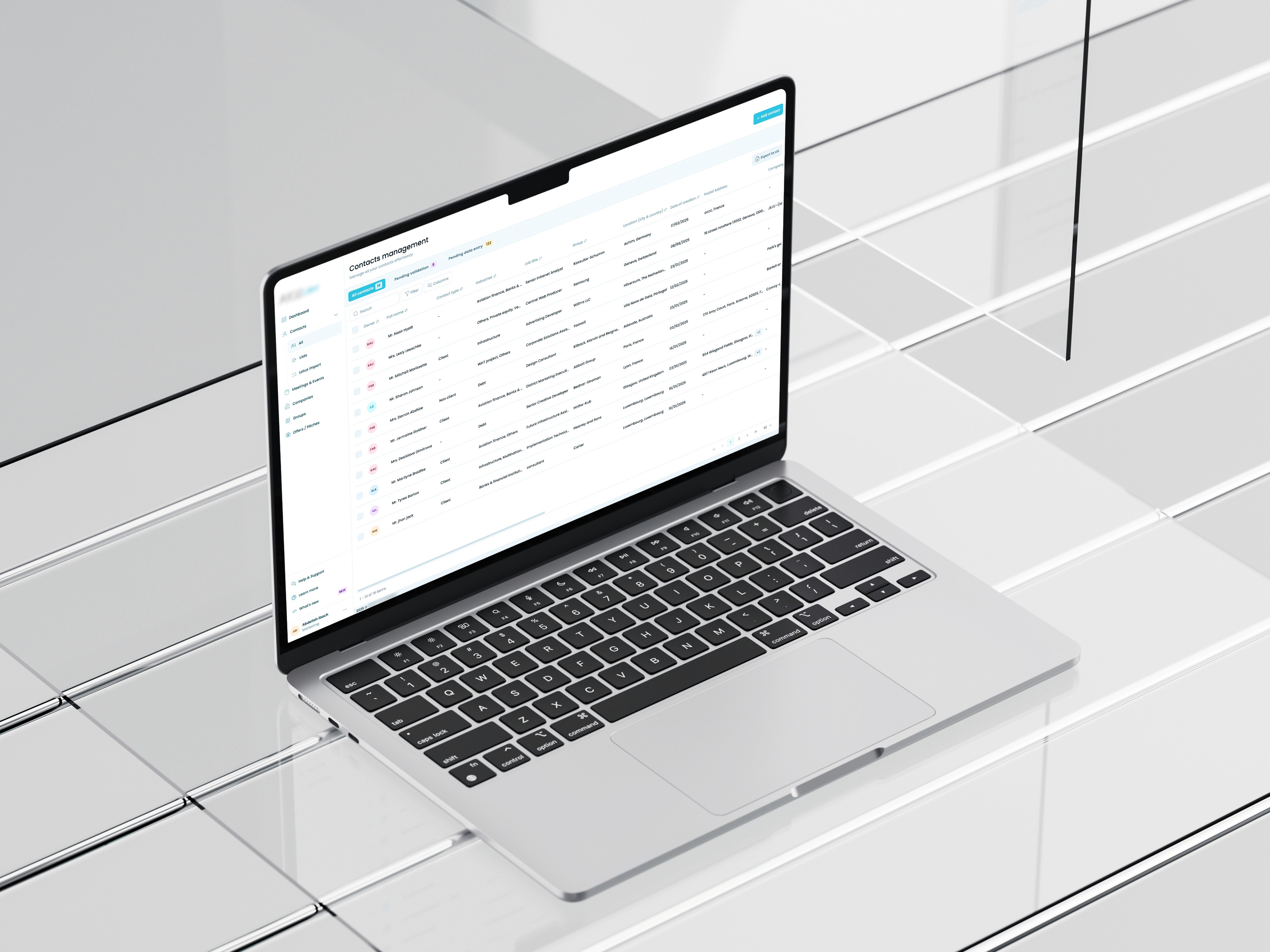
Streamlined workflows: tasks like creating a contact or adding an event could be done in seconds instead of minutes.
Clarity & consistency: a modern UI, clear layouts, and consistent patterns across modules.
Search & discoverability: improved navigation meant client data and pitches were always a click away.
Better adoption: by fixing broken flows, the intranet became the natural place for work rather than an obstacle to be avoided.
Outcome & Impact
The project ended with high-fidelity, developer-ready prototypes that were handed off to the engineering team for implementation.
Even without quantitative metrics, the qualitative improvements were clear:
Drastically reduced task times for partners and assistants.
Improved adoption, with employees relying less on Excel and external tools.
Intranet repositioned as a true productivity hub rather than a frustration.
Key Results
⏱️ Average client-event workflow reduced from 12–15 minutes → under 5 minutes
⬆ Daily active usage increased by 60% within 6 months
🗂️ Removed 3 redundant flows, saving team leads ~5 hours/month
🔍 Document search time dropped from 3–5 minutes → <30 seconds
Reflection
This project was a powerful example of how design can unlock productivity in high-stakes environments. By modernizing an outdated tool, I helped a top-tier finance firm reclaim valuable time, reduce frustration, and strengthen the foundation for better client work.